Web Design
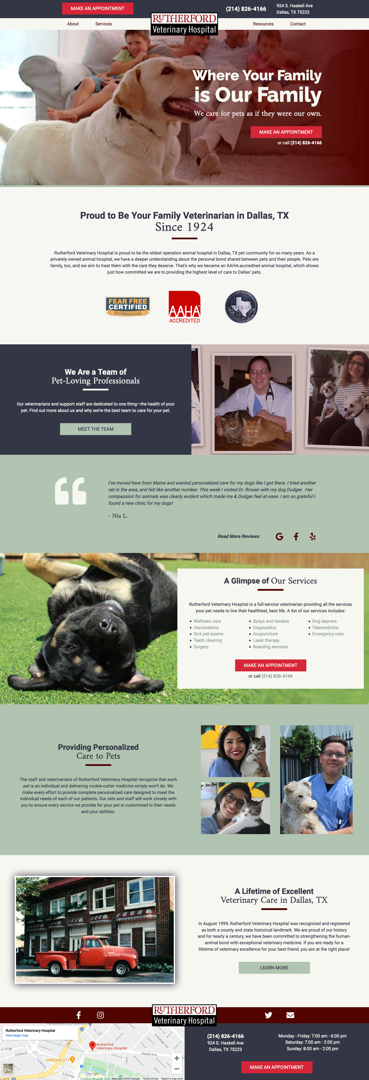
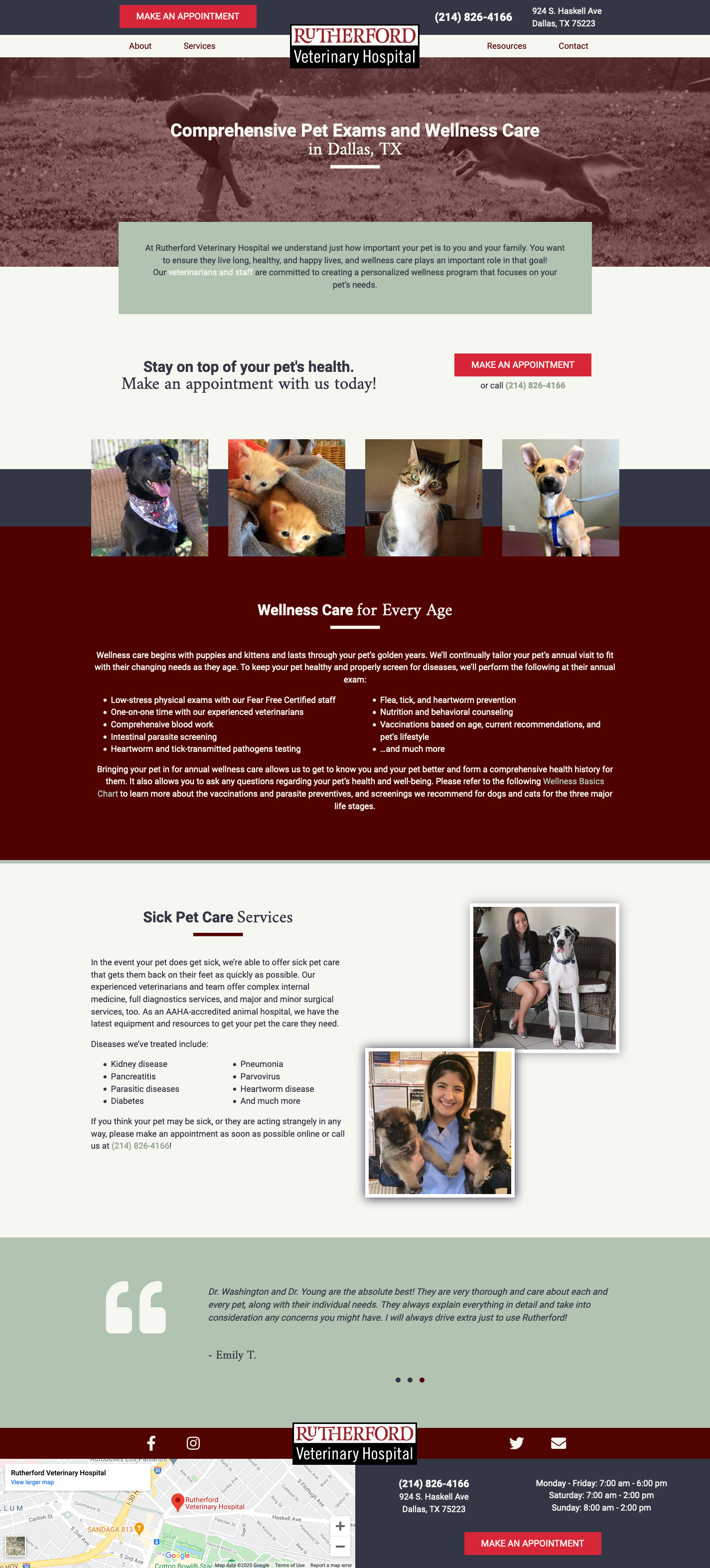
Rutherford Veterinary Hospital
A current client looking for a redesign, Rutherford Veterinary Hospital wanted a website designed to speak to their emphasis on family and their amazing history. Their building was officially deemed a historical landmark and their practice has been operating since 1924, needless to say, these were perfect things to feature in the design. Below are the images of the home page and pet exam pages respectively. Please view the live site to see video integration and interactivity for the full effect. Click on either image to enlarge.
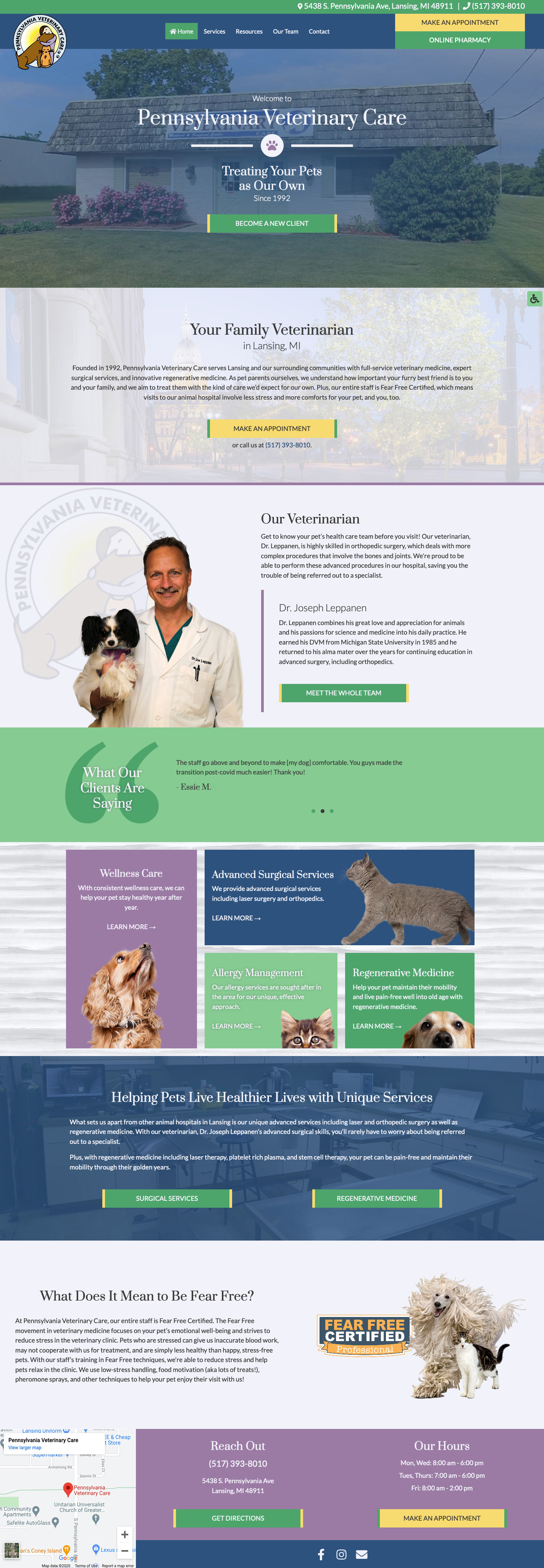
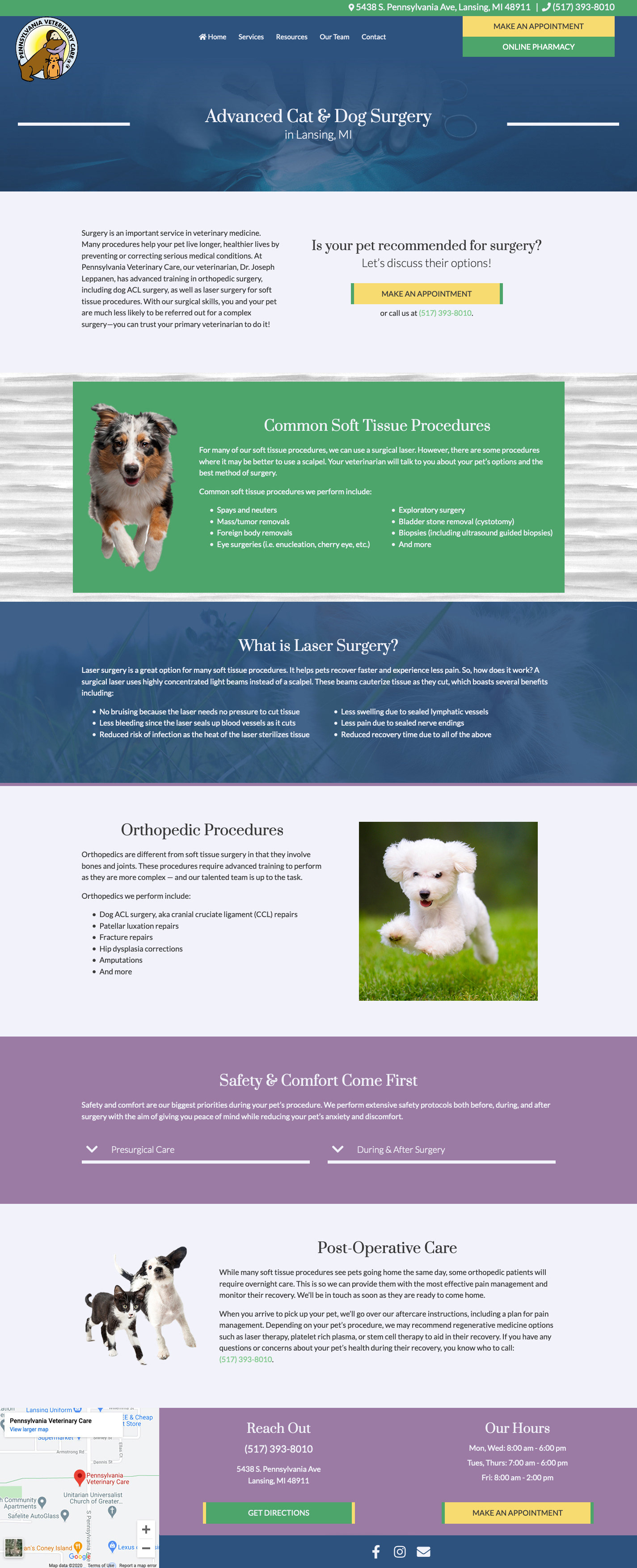
Pennsylvania Veterinary Care
Wanting to feature their hometown feel, Pennsylvania Veterinary Care did not ask much more than to have a modern site. So without much direction, I focused on what what was important to both veterinarians and pet owners alike: a clear and easy to understand call to action, featuring information about the veterinarian at the practice, and the inclusion of the hospitals credibility in the form of testimonials and their Fear Free Certification. The first image is of the home page, where you will find a video in the hero section. The second is of their most featured service, pet surgery. Click on either image below to enlarge.
Shmoop Mobile Page Redesign
As an exercise, I did a design audit and redesign on a mobile web page from Shmoop.com.
View the full case study by clicking the link below.
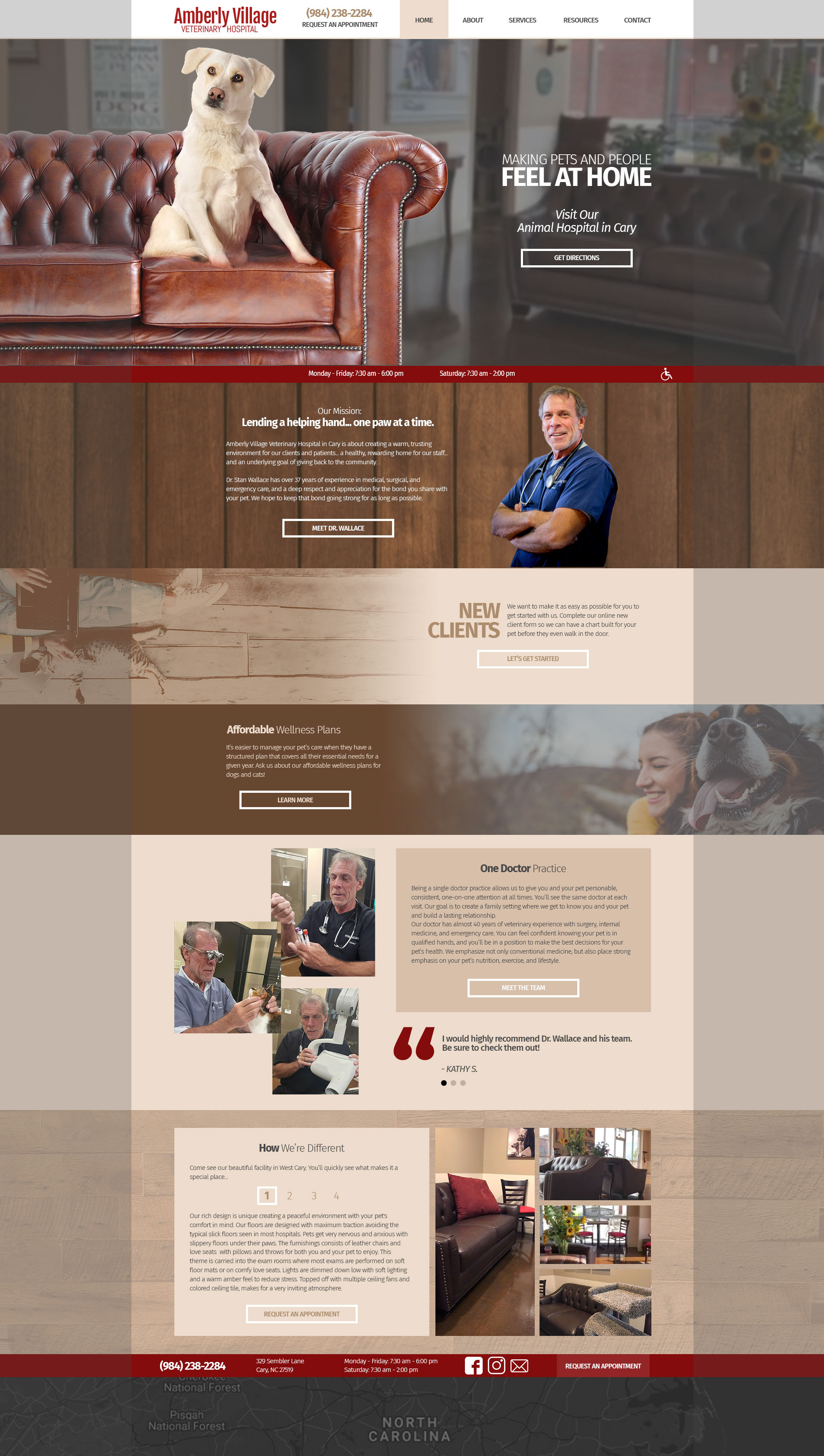
Amberly Village Veterinary Hospital
A new client, Amberly Village Veterinary Hospital wanted a website that had a masculine feel. They were drawn to incorporating wood and leather patterns into their design to match their hospital's recent remodeling. This hospital was started by a veterinarian who had been in the industry for years, but was starting his own practice for the first time.
From the information provided given at the start of the project, you could tell that this owner was proud of what he was able to build on his own, so this website had to reflect that. The end-goal for this hospital was to simply have a professional looking website. What was delivered offered that, as well as being an extension of who they were.
Had I gone back to revisit this design, I would make the Call-To-Action buttons stand out more to increase conversions for their hospital. Their live site can be viewed here.
Dark overlays were placed onto the sides of the layout to indicate to the developer that any design elements in this space would stick to the outside of the page. The first image is the home page, the second is one of their service pages. Click on either image to enlarge.

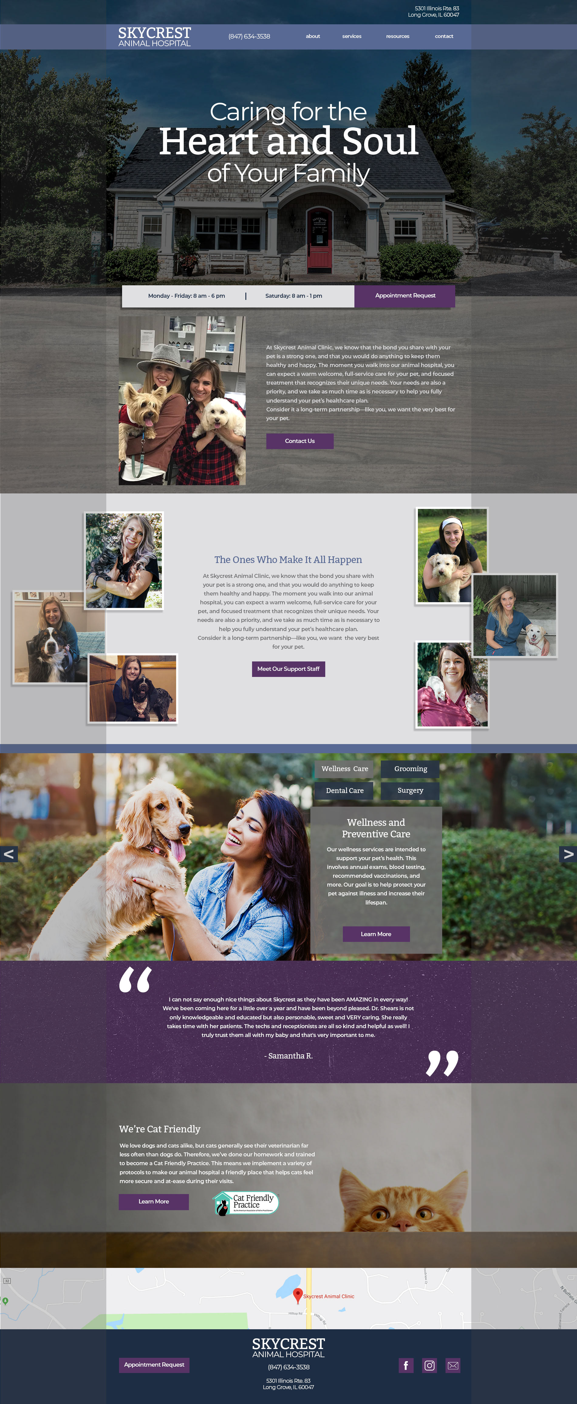
Skycrest Animal Hospital
As new client, Skycrest Animal Hospital, was looking for a website that offered a clean design. They requested that the design also somehow incorporate the feel of a high-end hotel's website, while matching the style of the architecture and interior design of their newly remodeled practice. Their requested colors were blue and purple.
So after reviewing the photo examples they provided of their practice, it was clear that they had a modern rustic interior, with grey wooden textures used throughout the building. I also researched various high-end hotel websites, finding quite a few having similar design traits that I used as inspiration. It was time to puzzle together all of these elements with the copywriting done by our team, photos from the practice's Facebook, and stock photography. Once I ensured that all necessary SEO components were visible once the page first loaded, I finalized the design you can see below.
You'll notice dark overlays to the left and right of each page, if a design element is in this space, it denotes to our developer to make sure these elements stick to the outside of the page, regardless of desktop screen size. These overlays are not intended for the finalized design. The first image is the home page, the second is one of their service pages. Click on either image to enlarge.